HERNE HILL VELODROME
DROME
FONT DESIGN - TYPOGRAPHY
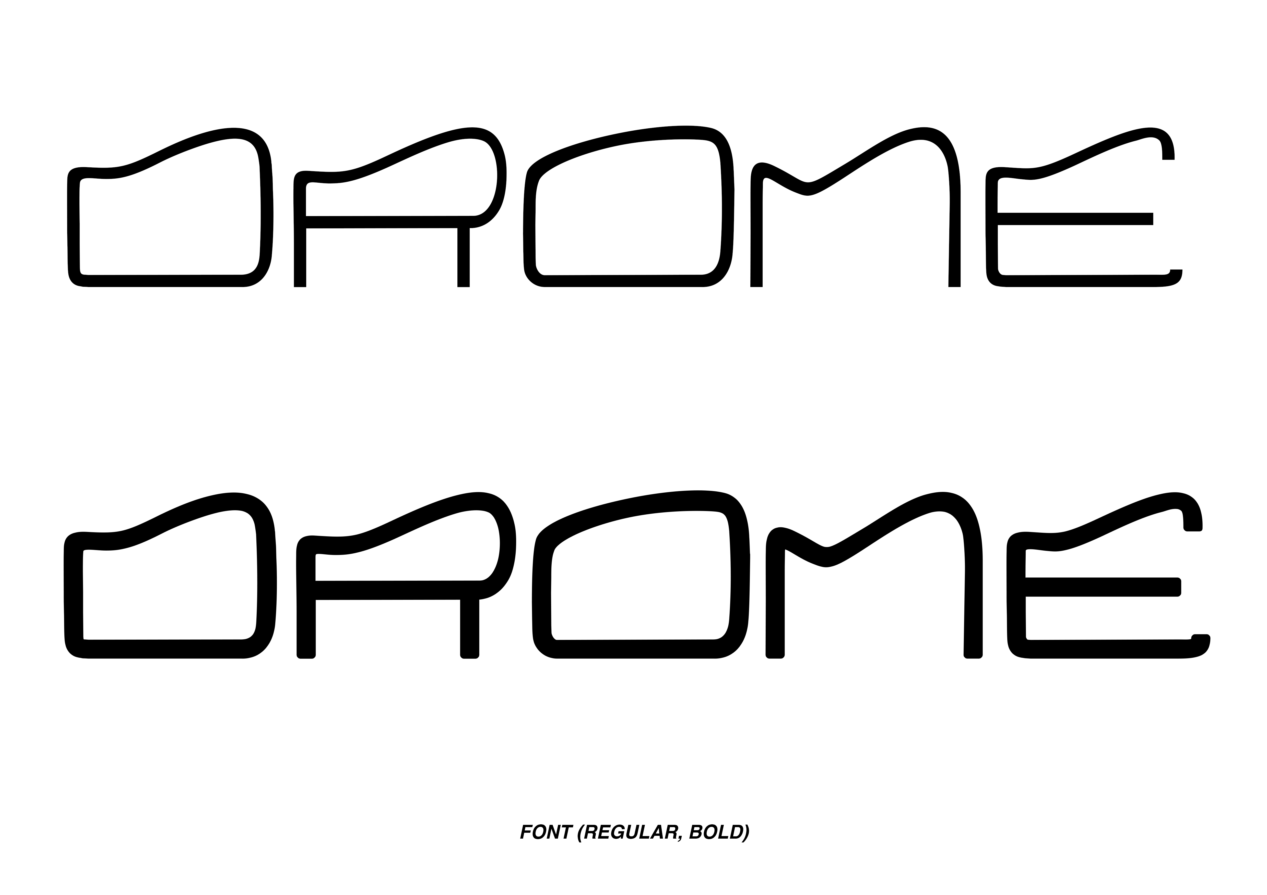
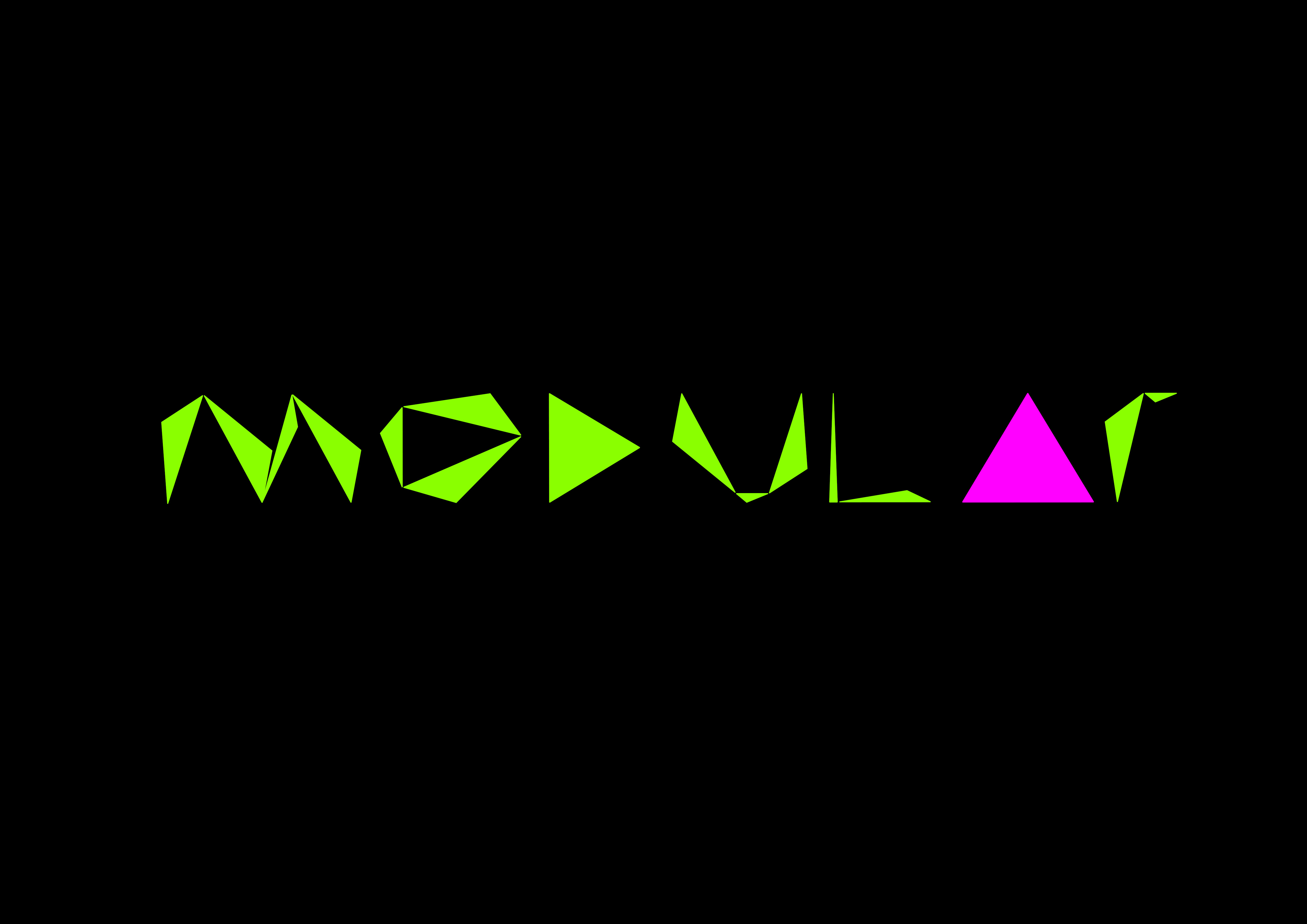
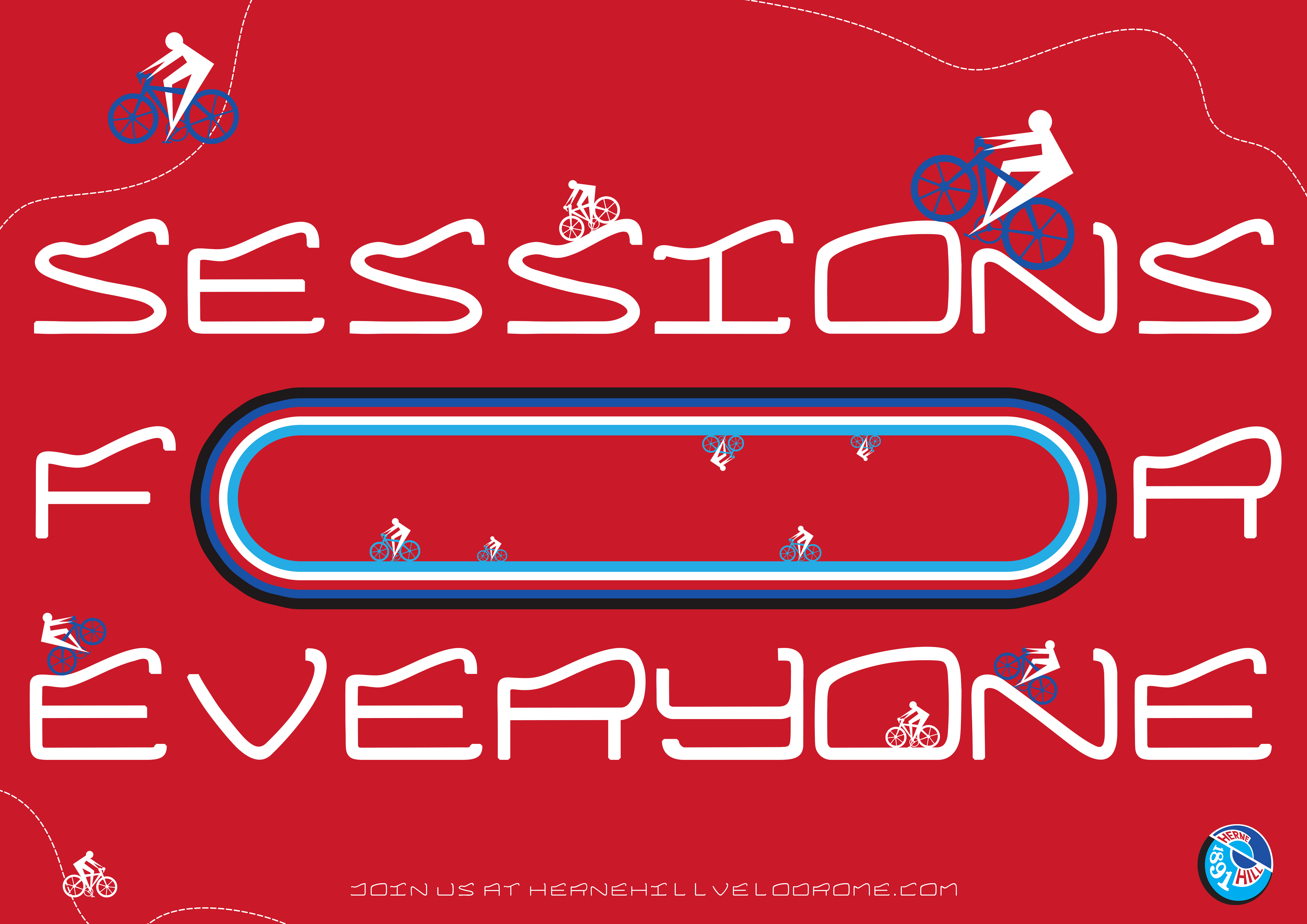
This is DROME, the typeface I built in honour of Herne Hill’s velodrome and pavilion. Gaining design inspiration through extensive visual and informative research, I developed a font which encapsulates their history dating back to 1891, as well as their new pavilion which was rebuilt in 2017.
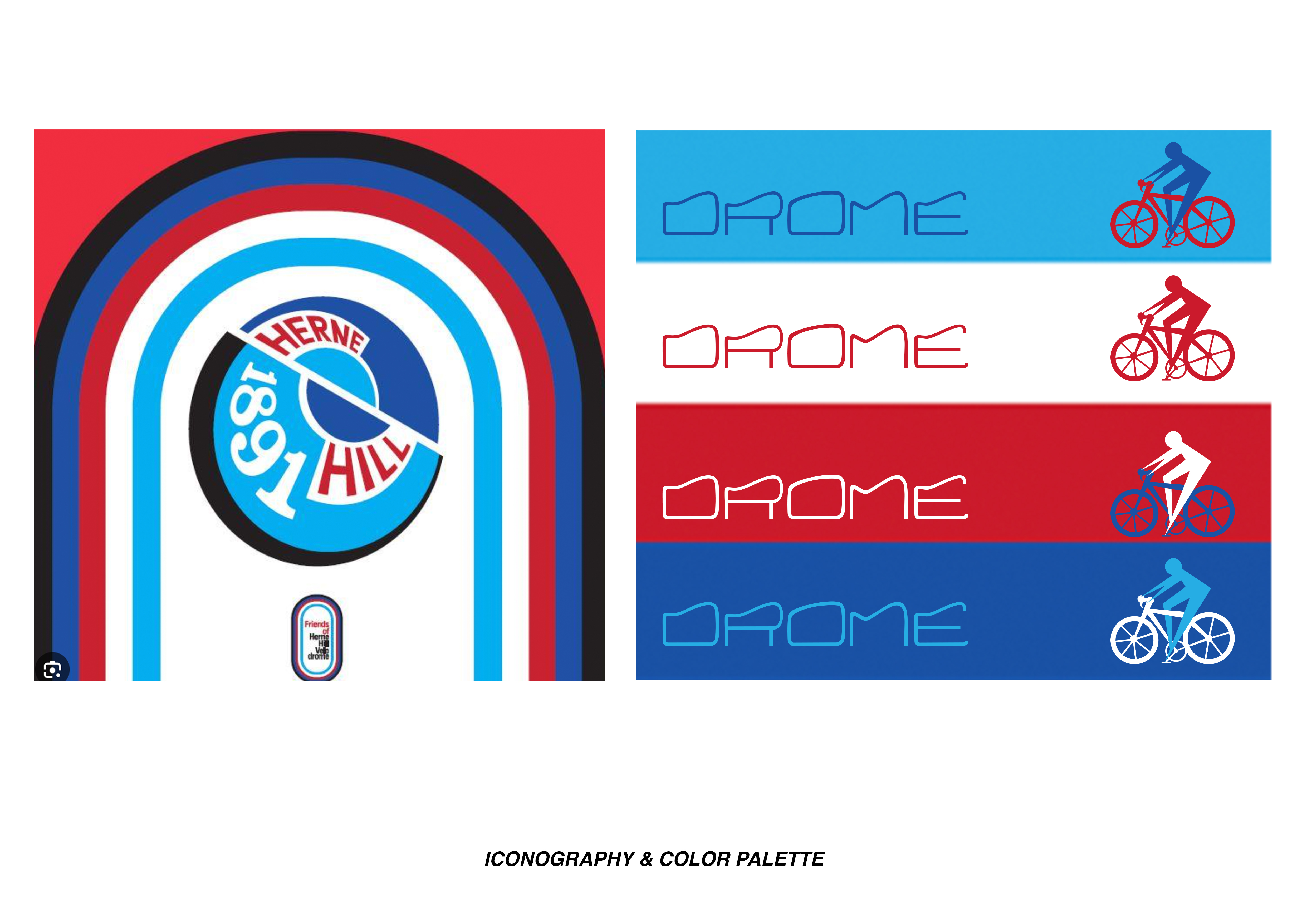
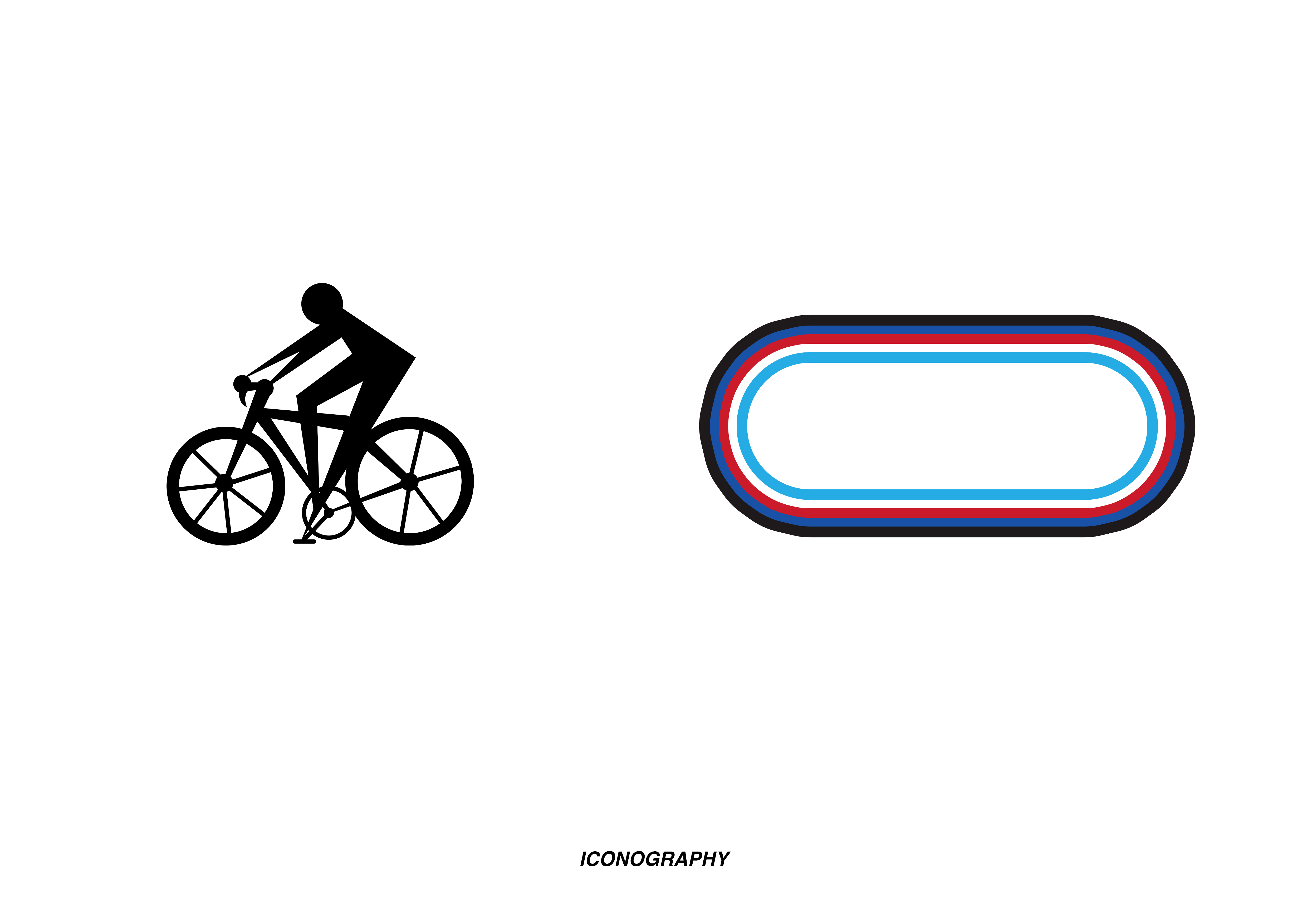
Developing structural curvature of the font inspired by the streamlined architecture of the pavilion, I built the lettering and numeral designs on Glyphs. As an example of how the font can be utilised to aid the branding of Herne Hill Velodrome, I created a series of promotional posters alongside a custom cyclist pictogram, adhering to their pre-existing color schemes.
You can visit Herne Hill Velodrome’s website here: https://www.hernehillvelodrome.com/


