JAMES AND SONS LTD
GRAPHIC DESIGNER
VISUAL IDENTITY - ADVERTISING
James and Sons LTD is an independent plumbing and heating services company.
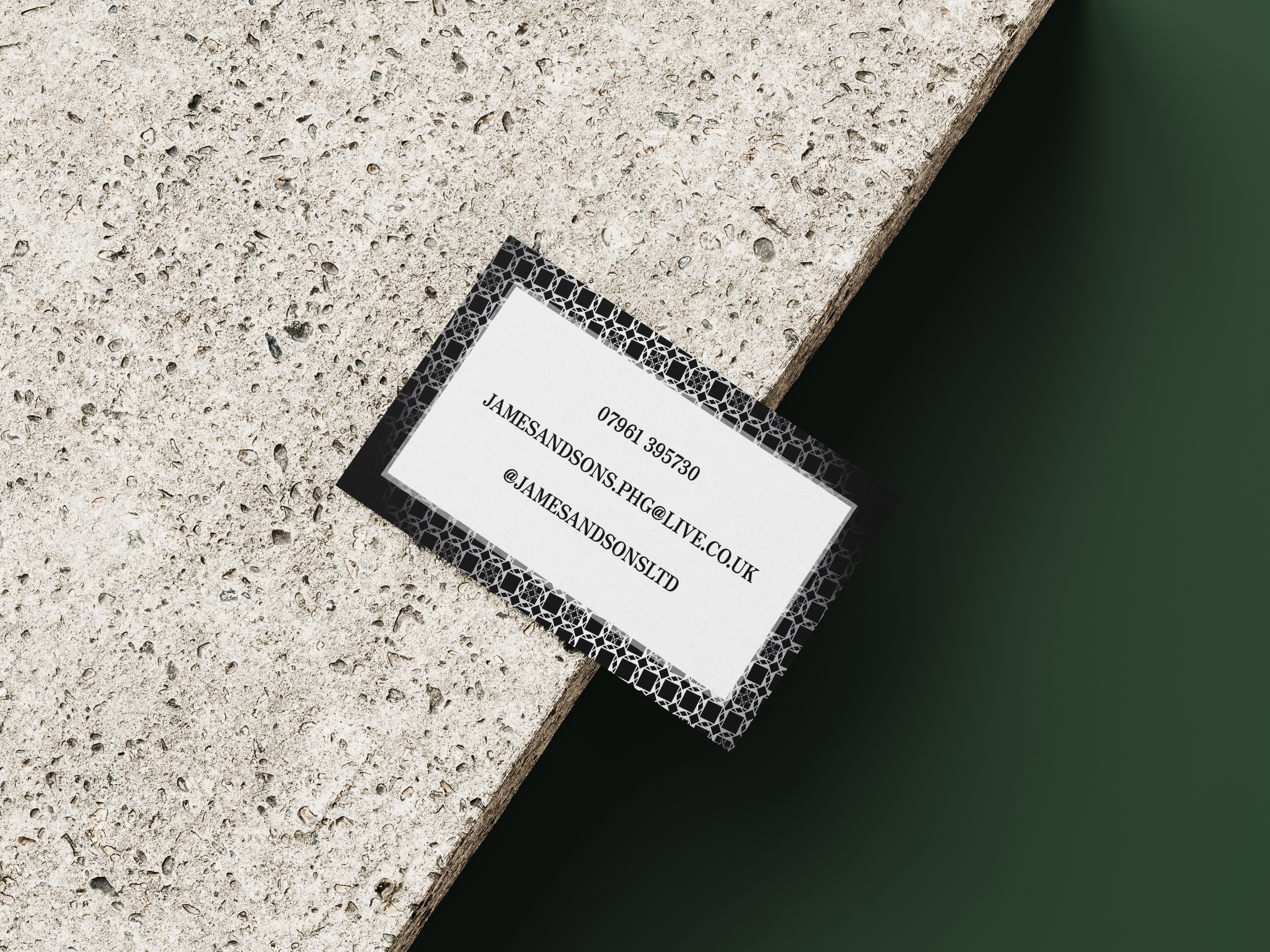
Approached with a business card request from this family run, 3rd generation company operating on a recommendation-only basis, the challenge here was creating a look which conveyed these grounded qualities, staying true to their heritage whilst also giving recognition to the ornate and high-calibre work they produce.
To visually encapsulate the level of opulence and finesse of their work, I chose to build the background pattern of the card design from some of the tiling work they had done recently for one of their clients.
From the shape of the tiles, I created a repeat print I was then able to layer with the other elements to separate the sleek dark background from the text.
One of the requests I received for this brief was to keep it minimal, so the absence of any flashy colors creates a refined look which speaks for itself. GSM and paper finish were also important components. For this, I considered the nature of the work and thus the environment in which the cards would be handled, in turn choosing options with maximum durability.
